It’s time. When it became clear that Mrs. G would be moving to a new home with my vision of a new experience store, I knew it was time to rebrand. My grandmother, Mrs. G, did the same when she moved to her new location back in 1969, her third move since 1935.
On April 26, 2015, it will be 5 years since my grandmother passed away. It feels like yesterday. Boy, I miss her, but she is still with me and still has an influence in the future of the store. I know she would love what I am about to introduce.
I did not want to rebrand Mrs. G on my own, nor did I want to rush the process (I don’t recommend a DIY re-branding strategy for any business). Rebranding consultant Raul Gutierrez was so patient with me. He knew this would be a very emotional experience: for nearly 80 years, my grandmother has been the face, literally, of Mrs. G, but we were going to completely change that. On Feb 12, 2014 he presented the first glimpse of the new Mrs. G. This was actually happening and it was exciting.
We started with an objective: To refresh and develop the Mrs. G brand, which will help achieve its goals of expanding into new product offerings. The brand will also help differentiate Mrs. G from the competition, which range from small family-owned retailers to the big box national stores.
Have a look below at the presentation prepared by Raul. I was blown away by his vision.
Brilliant Tagline: Life. Better.
It’s simple, straight-forward, and what we work towards every day here at the showroom. My sales team, my management team, my service team, my delivery team and I are here to make your life better with our large selection of top of the line, innovative, and affordable appliances and Serta mattresses.
After we had the tagline in place, we created our brand promise/mission statement. This would not only serve as a promise to our customers, but it would provide structure and focus for any decisions we made, from showroom layout to print advertising. Whether you’re a brand new business or one that’s been around, like us, for decades, it’s a good idea to have a written mission statement that is visible and accessible by everyone— the owner, the team, and your customers.
Building off the new tagline, Life. Better., Mrs. G’s new mission statement is: “We provide product and service offerings that make life better.”
Cook Better; Clean Better; Wash Better; Grill Better; Sleep Better……
Life. Better.
Once we completed the brand promise message it was time to work on the new logo. I always tell our customers who ask, ” How do you differentiate Mrs. G from all of the competition”. “We are a family business who cares about our customers and our community”. With so much competition, customers are driven to businesses they are familiar with, especially a local one. The logo needs to resonate the personality of the family business. As the CEO and president, I like being present in the store to meet and get to know our customers. I use the same philosophy of my grandparents, my desk will be in front of the store to greet customers and I will continue Mrs. G’s long tradition of supporting our local community and organizations. I know that in the nearly 20 years since I took over the family business, I have become synonymous with the store, so we agreed to update the logo to my face, but also keep some history in the final design.
Raul created a new personality logo with inspiration from the 1969 logo that was created by Princeton architect Robert Hillier. He chose the colors yellow and black to communicate an image of energy and warmth that resonates in the Mrs. G promise of Life. Better. After we completed the logo I had time to offer a few customers and business associates a sneak peak to get feed back. Everyone loved it! Here is the new logo.

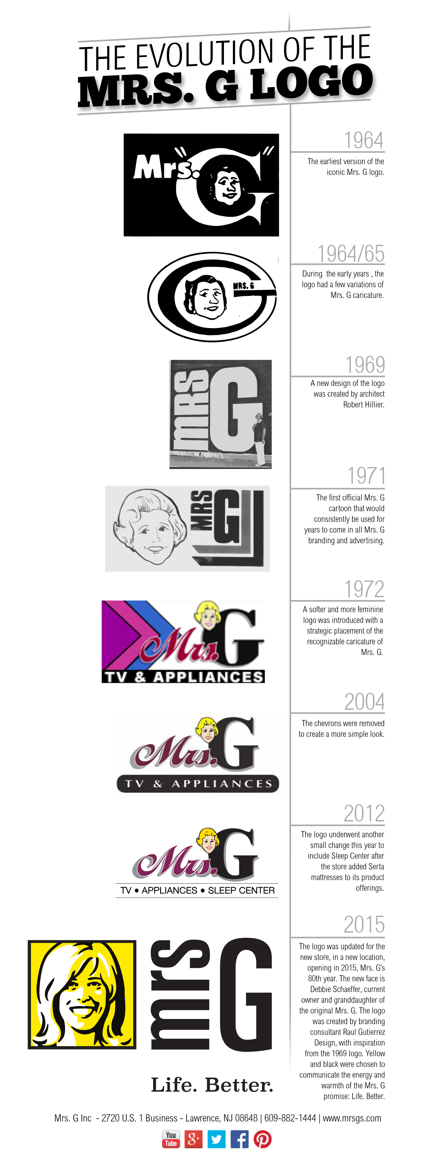
The following infographic, created by John LeMasney, displays the Mrs. G portrait logo introduced in 1964 and how it has evolved over the years.

The new sign installation began in the Lawrence Township Construction Department for approval. My grandmother’s best friend’s daughter works in the office. When she saw the new sign on paper, she replied,” Debbie, I love the new logo. You look just like your grandmother”.
WOW!
The logo will be on the storefront soon. Follow the progress of the new store on our Facebook page, and check back after the new experience store opens for my behind-the-brand recap of that process!
Now my plans are to work on creating a great vision with the help and inspiration from the team at Zing Train. Stay tuned….


11 Responses
Debbie, love the new logo. A fresh new look for your beautiful new store!
Thank you, Deborah.
I love the new logo. I feel like I know Mrs. G. personally. 🙂
Thank you Khurt! Go Blue!
Debbie, the updated logo is befitting the 2010s – a great contemporary look. This is so exciting!
Thank you Robin!
Great Logo and Go to Market Strategy, I’m a fan of anyone who is forward thinking in their approach. Best of Luck, Debbie – KB #NJLiving #BetterHomes #CentralJersey
Thank you Kwadi!
Superb!
Thank you Sherri!
I have been through many years of the evolution of Mrs G’s. Now Debbie has brought her vision for a new and exciting rebranding to the area’s best Appliance retailer. After 80 years, the future is bright and exciting, Thank You Debbie!