Oftentimes customers ask me what appliances I have in my home. What does the owner of an appliance and television store have in her home? Here’s an inside peak.
[youtube]https://www.youtube.com/watch?v=GWgBIjGYvc4[/youtube]

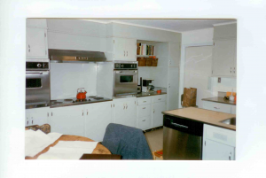
- Debbie’s Kitchen Before
I purchased my house in 1998 from the estate of the original owners. The house was built in 1951 and the only items changed in the kitchen from the original construction were two 24” 1974 Thermador stainless steel ovens, as well as the refrigerator and dishwasher sometime in the 1980s. Frankly, the kitchen was state of the art for the 1950s. The cabinets are very plain but in good condition. Ugly accoustical tile was glued to the ceiling probably to absorb the odors and sound. Additionally, the floors had a few layers of vinyl over the original linoleum, probably to match the changing color of the cabinets over time. For lighting, there were a few 1950s recessed square lights that did not do a very good job of lighting the kitchen.
When I moved in, I had the cabinets painted and only upgraded the refrigerator and dishwasher. The two Thermador ovens and a 1951 Thermador 48” electric cook top were still working fine. The 18 cf top freezer refrigerator actually stood alone in a big open space. A 48” Sub-Zero Stainless Steel refrigerator fit perfectly in this space with some minor alterations. I chose a KitchenAid stainless steel dishwasher to complete the look.
In 2001 (three years later), I was ready to upgrade. The first item on the renovation list was to take down those ugly ceiling tiles and add quality recessed lighting and replaced sheetrock. TJ Tindall from The Light Gallery created a perfect lighting plan for the kitchen with small recessed halogen fixtures. What a difference a ceiling can make especially with great lighting! I actually liked the layout of the kitchen with a minor move of the peninsula, a popular feature for 1950s, to a large central island that took up the space of the kitchen table. The island measured 8 feet long and 4 ½ feet wide. You could fit six people comfortably around the island. Big islands were just taking off in 2001. The trend still continues with larger kitchens having two large islands. I basically cut the peninsula off and used the cabinets as the island cabinet and actually built another cabinet to match the old ones and made new doors to cover the hole of the peninsula. I had a very limited budget, so purchasing new cabinets was out of the question.
The island housed the sink and dishwasher. I struggled coming up with a suitable countertop. The existing countertops were formica with stainless steel edging. I did not want formica. 1951 cabinets did not go with granite. Wood was out, because bacteria tend to spread in wood. The utilitarian nature of the design called for stainless steel tops. They were just coming into style, but no one was talking about how easy they scratch. I loved them for the first 15 minutes they were installed and the rest was a nightmare, especially with twin eight year olds in the house. After 9 years I still hate them. Don’t let anyone talk you into stainless steel tops. I actually had a stainless steel sink molded into the countertop. Now that was neat! The countertops were made by Trenton Sheet Metal from Trenton, NJ, they actually made Elton John’s famous stainless steel sleigh bed. They did a fantastic job!
Moving the peninsula meant I had to do the floors over. Once again I struggled with the selection of the material. Vinyl? No! Wood? No! Granite? No! Actually I came across Marmoleum linoleum flooring. Perfect! They have so many colors and patterns and I was happy to find out it’s made primarily from natural raw materials. I chose 18” beige and tan squares set on a diagonal in a harlequin pattern. It’s pricier than you think, but it looked fabulous and soothing on bare feet. Regent Floor Covering, another local favorite, offered a fine selection and amazing installers. I lived with this phase of the renovation for a few years.
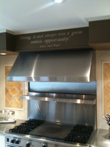
Fast forward to 2004. I just could not look at that 1951 cook top anymore though it was working fine. It was time to upgrade the appliances, except for my beautiful Sub-Zero. A 48” Wolf range fits perfectly in the space of the 48” 1951 cook top. Of course I have to go against the masses and get the black knobs, instead of the signature red ones. A Wolf hood replaced the 48” 1951 broan hood. I removed the two ovens one on each side of the cook top and just left it with open space and replaced each side with 24” wide countertops. Yes! Stainless steel. I was stuck in a black hole of stainless steel countertops and I could not escape. I also changed the rest of the formica counters to stainless. Nightmare of scratches! The broom closet was removed to house a Sub-Zero 27” tall wine refrigerator with refrigerator drawers. My daughters love the refrigerator drawers. They hold their fruit, snacks and water. It’s their refrigerator. Next to the new wine refrigerator was space for books and a tube set TV that changed into a 19” flat screen, along with a Miele built-in coffee maker.This kitchen was starting to look really cool. I switched out the Kitchen Aid dishwasher to a Fisher Paykel double dish drawer dishwasher. Love loading the drawers and so much easier on my back considering I am 5’10” and I wear heels all the time. I also added a Kohler steamer next to my sink. Healthy cooking is a priority in my house. Budget was busted! I couldn’t even fill the 70 bottle wine cooler.
Fast forward to 2006. Time to repaint the cabinets and liven up the kitchen. The cabinets are still in good shape and I do like the layout and the retro look. To freshen up the cabinets I updated the handles and hinges. I wanted some color but because of the utilitarian nature of the cabinets off white was the only color that worked for me. I picked out some whimsical tile for around the range and cream subway tile for the rest of the backsplash. The walls were painted a chocolate brown. Wow! Does it look marvelous even in 2010. I love it! For my last designing spree I had a calligrapher script above the range a quote from my favorite architect, Frank Lloyd Wright, “Dining is and always was a great artistic opportunity.”

Back to 2010. Now I am looking for two really cool chandeliers with those cool round shades around the fixtures for over the island. I just need time to shop.

No responses yet